Pages

Showing posts with label techniques. Show all posts

Friday, July 10, 2020

Cattywampus


Oh my goodness, how fun is that word?! Say it with me... catty-wampus![ kat-ee-wom-puh s, kat-uh- ] LOL! Love it!

I had never heard of the word until Sara Emily posted it as a challenge on The Funkie Junkie Boutique Blog. Sarah quoted it as meaning..."appearing off center, diagonal from, crooked or not level, appearing askew, tilted or lopsided". She mentioned that it is something she hears around her home area in the Southern States.

It made me think of kitty-corner or catty-corner. I had the urge to look it up discern the origin... waywordradio.org had this, "We do know the word has been around for more than a century and is spelled many different ways, such as catawampus and caddywampus. It may derive from the Scots word wampish, meaning to “wriggle,” “twist,” or “swerve.”

This definition example from yourdictionary.com made me laugh because of the true to life picture it created in  my mind... "An example of something cattywampus are the positions of the items on the top of a coffee table after a two year old has been playing with them and moving them around."

Oh words are so much fun! Anyhow, I digress... on to the task at hand, sharing my Cattywampus creation!


I created an ICAD with my mind on using up one of my little bitty bobs baggies that I had curated a while back. Using multi medium matte, I collaged the index card with a dictionary page from the 'C' section where cattywampus would have been if it wasn't a simple affordable home dictionary from 1977 that I found for crafting use. Then, I applied scrapings of white gesso and once dry a little touch of clear gesso knowing that I was going to add watercolour on top. On my craft mat, I scribbled a good amount of Chocolate gelato and mixed it with glass bead glitter gel. I stenciled with it through the Crafter's Workshop Mini Damask stencil. I use the excess on another sized index card and what was left of the dictionary page. Once the gel was dry, I scrapped a bit of gesso to add some white bits to the damask. Once that was dry, I added on Vintage Pink Glimmer Mist with the nozzle tube end around the damask areas. Then, spritzed it with water and angled the card to get the colour to run. After it set up a bit, using the nozzle tube again, I added some splatters. While that was drying, I scraped some gesso onto the play word, edged it with a brown sharpie and distress inked it a bit. 


Next, I glued down the cheese cloth, lace, and old athletic tape all a bit cattywampus. I added the Create transparency and secured it with a mini brad and a few drops of Glossy Accents behind the 'A', 'T', and 'E'. I used a scrap bit of uneven dyed muslin to mat the corrugated play word and added the die cut butterfly slightly a skewed. Lastly, I added a second mini brad and a meandering brown craft wire for the final cattywampus touch.


Supplies: index card (Staples), glass bead glitter gel, Chocolate gelato (Faber-Castell), Vintage Pink Glimmer Mist (Tattered Angels), Mini Damask stencil (The Crafter's Workshop), Multi Medium Matte, Glossy Accents, Tim Holtz Vintage Photo Distress ink (Ranger), White and Clear Gesso (Liquitex), NoName cheesecloth (Loblaw's), circa 1977 dictionary page (Webster's Dictionary), brown marker (Sharpie), athletic tape, lace, Create transparency, corrugated Play word, die cut butterfly, craft wire (Misc.)


I had so much fun making this ICAD, that I decided to use up some other scrap bits and the pieces that I had used the leftover glass bead glitter glue on to make two ATCs for trading.


On this one, I added cheesecloth, spritzed kraft cardstock and old athletic tape and sewing it with a zig zag stitch with embroidery thread. I used a fussy cut Prima Apricot and Honey butterfly and pink craft wire for embellishments. The Magenta Make Time to Play was stamped with Black Soot Archival ink.


On this one, I first stamped the background with Finnabair Messy Writing stamp with Jet Black Archival ink. I added tan tissue, the spritzed kraft cardstock and lace. I fussy cut another Prima butterfly but it was too pale against the background so I watercoloured it with Bubblegum and Guava pink gelatos and added highlights and shading details with a Staedtler brown and white pencil  crayons and then outlined it all with a Stardust Gelly Roll pen for some sparkle.


Again, I added the pink wire and this time the Create title is a Tim Holtz rub on.

If you are interested in trading one of these ATCs, just let me know in the comments below.


TTFN,


Saturday, May 30, 2020

Blessed - Magenta


Hello Crafty Friends! Today, I am up on the Magenta blog with my monthly DT post sharing this mixed media card creation. From my last post, you know that I have been playing with a faux plaster/stone floral mixed media technique with a variety of paste bases.


I started by spreading out some Golden Light Molding Paste on a craft mat. Once it was not sticky to the touch, I spritzed the Script and Postmark stamp with water and then pressed it into the paste in a variety of places. Next, I spritzed and pressed the Poppies stamp into the paste.


Once dry, I added watered down black acrylic paint so it would seep into the script and cracks. After letting it set up a minute or two, I removed the excess off the top surface with a baby wipe. Then, I painted the poppies with Dina Wakley Scribble Sticks using a waterbrush. Once dry, I matted it on a 4" x 6" black card base with a layer of cereal box board to give it a little dimension. Lastly, I added a slightly distressed sticker sentiment.


Supplies: Script and Post and Poppies stamps (Magenta), Light Molding Paste (Golden), black acrylic paint (DecoArts), Dina Wakley Sedona and Olive Scribble Sticks (Ranger), Tim Holtz Big Chat sticker (Advantus), black cardstock (Bazzill), white cardstock card base (Staples)

Once again, I am pleased with how this one turned out. I have two more faux plaster/stone floral paste bases that I have yet to play with. Looking forward to trying them out too.


TTFN,


*****

Magenta products used:

Poppies

Friday, May 15, 2020

Bleeding Art May Challenge


Hi crafty friends! I have to start out with a Yeah for mid May! I have been waiting for this day for two months. Today, is my first official post as part of the Bleeding Art Challenge Blog Design Team. We host a monthly mixed media Anything Goes Challenge which draws such a variety of styles from around the world. My inspiration creation for this month's challenge is a faux plaster/stone floral mixed media canvas.


I started by creating a taped off 5 1/2" x 4 1/4" area on a craft mat and then I spread Ranger Texture Paste with a spatula in the space. I let it set up enough that if I could gently touch the surface and it would not lift or move the paste. I then spritzed the Magenta Doodle Flower stamp with water and then pressed the stamp into the paste near the top right section and repeated the process for the bottom left part to create the floral focal point. Next, I took the Script and Postmark stamp and spritzed it with water before pressing it into the surface in multiple places to add dimensional texture interest.


Once it was dry, I coloured it with Tim Holtz Distress Ink products. I spritzed the whole piece with Vintage Photo Distress Spray Stain and then blotted up all the colour on the panel surface leaving it to well in the script, flower outline and post mark impressions. Next, I spritzed the whole thing with Antique Linen Distress Spray Stain. Once it was dry, the Antique Linen was too light so I used a small brush and added some Distress Vintage Collage Medium which also worked to seal the colour. Then, I coloured the flower using Wild Honey Distress Ink for the flower petals and Peeled Paint for the stems and leaves. I decided at that point the the panel background colour didn't provide enough contrast to the flower's colours so I used my fingers to dab on little bits of gesso being careful to stay on the flat surface and not fill any of the cracks. 


While the floral panel was drying, I turned my attention to creating the background base. I covered a 5" x 7" dollar store canvas with black gesso. Once that was dry to touch, I adhered the black tissue paper with collage medium, crinkling and scrunching the tissue as I went along covering the entire canvas. Once the tissue was glued down I then added a coat of the medium on top and set it aside to dry. Once it was dry, it has a bit of a gloss sheen but only in some sections that I wanted to get rid of as well as I wanted the crinkled tissue texture to show more so I simply ran my emboss buddy across it depositing some powder over the surface that did the trick.


Now, I was ready to it all together. I adhered the panel with two layers of cereal box board beneath it to pop it up a bit onto the canvas. Next, I created the bloom word strip on my computer using a type writer font for the text in white and word highlight in black and printed it onto cardstock. After cutting it out, I adhered it with Multi Medium Matte to the panel to finish it off.


There you have it... my finished mixed media seasonal panel. I love the vintage antiqued faux stone/plaster cast look that I achieved. I am thinking I will do a series of these and then hang them together in as a collage.


Supplies: Flower and Script and Postmark stamps (Magenta), Texture Paste, Tim Holtz Antique Linen and Vintage Photo Distress Spray Stains, Wild Honey and Peeled Paint Distress Inks, Tim Holtz Distress Collage Medium and Vintage Collage Medium, Multi Medium Matte (Ranger), gesso (Liquitex), canvas (Dollarama), black tissue (misc.)

Head on over to the Bleeding Art Challenge Blog here. As you will see from the design team inspiration, there is an eclectic mix of projects and styles. Such ingenuity and creativity all packed together. The challenge starts mid month and you have a month's time to enter.

Happy Crafting!

TTFN,


Thursday, April 16, 2020

A Mother's Love - Guest for the Funkie Junkie Challenge


Hi crafty friends! Today, I am delighted to be sharing a shabby chic card as a Guest Designer over at the Funkie Junkie Boutique Blog for their newest challenge.


I was excited when I learnt that Sarah Emily's theme for this challenge was a Mother's Love.... perfect for a shabby play with Prima pretties using the Apricot Honey collection. I started with a 6" x 4 3/4" piece of the B side of "Tiny Blossoms" patterned paper applied Ranger Opaque Crackle Paste through the Finnabair Tapestry stencil. I then turned to the Prima mold created lock embellishment by brushing on Finnabair heavy white gesso. 


I love up-cycling - finding ways to reuse or re-purpose things in my creations. You might be surprised to learn that I created the lock embellishment from a fiber drink cup holder tray. You can find out how I did that in this post here. 


While both pieces were drying, I began fussy cutting flowers from the "Tiny Blossoms" & "Apricot Honey" patterned paper. Once the paste had dried and done its crackle thing, I added Rose Prima Pastel Confections watercolour paint. When I was happy with the colour density and look, I finished the panel with paint splatters. Using my finger, I dipped it into my watercolouring water, and then picked up some of the Lemonade watercolour paint and dabbed it onto select parts of the gessoed lock embellishment giving it a pretty shabby distressed look. Then, I once again turned my attention back to more fussy cutting along with cutting out a mini card from the "Happiness looks good on you" paper and distressing its edges.


With everything dry, I was ready to start assembling. First, I distressed the edges of the panel and them adhered it to a 6 1/4" x 5" white card base.


Next, I used scrap pieces of cereal box board and glued them down in the centre. Then, on top of that, I arranged and adhered the a layer of the fussy cut flowers along the edges to pop them up a bit for added dimension.


Next, I adhered two more layers of box board to the back of the distressed Love card and glued it into the centre. I filled in any areas with scrap pieces of flowers and leaves. Then, I adhered the lock embellishment, the AC Thickers "Be Kind" rose gold foam glitter letters, the bitty butterfly and added pink tiny glass beads along the edges of the Love card and called it done.


I was so happy with the results! It was such a pleasure to make this card and I want to thank the design team for having me join in. I hope you all enjoyed my take on the challenge and that it inspires you to get messy and create. Here's another look at my completed card.


You can head on over and leave some love on my Guest Designer post here and you can get the challenge details and link up an entry here.

Stay safe and happy crafting!


TTFN,


Saturday, March 28, 2020

Love & Hugs Bookmark


Hello creative friends! Today's crafty creation is inspired by Hero Arts' Anything but a Card challenge and Kathy Raccosin's The Daily Marker 30 Day Coloring Challenge. My colouring medium of choice once again is watercolouring. This time I used a watercolouring stamping technique with Tim Holtz distress inks and the Hero Arts Florals Rose Stem stamp along with my MISTI.


I started by placing a trimmed piece of Strathmore 300 Series Smooth Bristol paper into my MISTI and then inked up the Rose Stem stamp flower section with Abandon Coral distress ink and spritz it with water prior to stamping it. Once it was stamped, I used a waterbrush and ink smooched on a craft mat to watercolour the flower. Once the ink had absorbed into the paper, I reloaded the stamp with Abandon Coral ink and re-stamped it once again. Then, I repeated the process for the leaves, stem, and stamen with Peeled Paint Distress ink. Once one flower was done, I re-positioned the stamp to the next spot and repeated the same process.


Once all three flowers were complete, I stamped the Hero Arts Love & Hugs from the Rose stamp set sentiment three times with Jet Black Archival ink. Next, I placed the Hero Arts Ornate Floral Stencil over top of the bookmark and used a sponge inked up with Broken China Distress ink to add in a bit of a blue background. Then, I splattered the bookmark with the coral and green ink. Once that was dry, I tacked the panel to a Kraft base and stitched it together to complete the bookmark.


I am also entering this into the Simon Says Stamp Wednesday Everything Goes challenge along with the Hero Arts Anything But A Card challenge.   


TTFN,


Friday, March 20, 2020

Life is Better with You Friend


Happy Spring to those readers that are from the northern hemisphere (and happy fall to those in the southern one)! I chose a bright cheery spring colour combo for today's colouring as I join in Day 20 of Kathy Raccosin's The Daily Marker 30 Day Coloring Challenge with another Angie Blom Digital Design stamp for this card. This time I used the Unicorn Love digital stamp laser printed on Strathmore 300 Series Smooth Bristol paper and watercolours. You can see my swatched watercolours combo on the bristol strip beside the finished card.


I started by using a Molotow masking fluid pen and covering all the little circles, dots and V hearts along with the single line curls in the mane. Next, using Mijello Mission Gold watercolours, I painted the top part of the background with Cobalt Turquoise. Once it was set but before it was dry, I placed the older Prima Jamie Dougherty Spark stencil over it and using a dampened papertowel, I removed some of the watercolour through the stencil to add some texture and interest to the background. While that area was drying, I turned to colouring the flowers on the unicorn's head. I used some already mixed greens from my Mijello Paint palette and used a watered down version of Bright Clear Violet for the first layer of the flowers and then added more concentrated touches. 


Next, I turned to the unicorn's body. I added in shading with a grey/graphite Stabilo All pencil and activated it with water. Then, I watered down some Vicki Boutin Iridescent CreativeFX glaze and painted the body with it to give it a pearlescent shine for some magical shimmer quality. The shading didn't show through enough in some areas so I added a touch of Indigo watercolour to the mix and then painted over the shaded areas to define them more. Next, I added some white watercolour to a bit of the iridescent glaze to lightened areas that I had left for highlights. It is really hard to show the shimmer in a photo but I tried angling the card as I was taking the photo to see if I could pick it up. If you look at the ears and carefully on the body, you might see it. 


Then, I coloured the grass. I started with a wash of Yellow Green and then added bits of Sap Green and Hooker's Green. While that was setting up, I erased the masking fluid from the single curl lines of the unicorn's mane. Next, I added the final green touches with a concentrated amount of Sap Green on the blades of grass and in the circles and leaves.


Next up was the mane. For pink, I used the Zig Clean Color Real Brush marker. I started by pre-wetting sections that I was going to work on with water. Then going in with the marker along the ends and using more water and a number two brush round brush to pull the colour up through the sections to create an ombre effect. While that was drying, I added some touches of pink to the background v hearts and iridescent glitter glue to the dots, circles and v hearts. Then, I erased the masking fluid on the mane and added the glitter glue there too. Next, I did the same to the grass and the unicorn's corn and set it aside to dry while I cut and folded the card base.

Now with the painting dry and complete, I die cut it with the Simon Says Stamp Wonky Rectangles die. To finish off the card, I adhered scrap cereal board to the back of the die cut panel and glued it onto a white cardbase that I sized to allow a 1/4 inch frame area. For the sentiment, I used the one that comes with the Fox and the Owl digital kit that I had laser printed on my initial bristol piece. I cut it out, cereal board backed it and adhered it to the card. I went over some of the lines with a Pigma Micron 005 black pen to darken them. Lastly, I punched out some mini butterflies from the scrap cast off areas from the die cut panel background and added two of them. Here is a another look at the finished card:


Supplies: 300 Series Smooth Bristol (Strathmore), white cardstock (Staples), unicorn and sentiment digital stamp (Angie Blom Digital Designs), Mission Gold watercolour paints (Mijello), pink Zig Clean Color Real Brush marker (Kuritake), grey/graphite All watercolour pencil (Stabilo), Vicki Boutin Iridescent CreativeFX Glaze (American Crafts), Jamie Dougherty Sparks stencil (Prima), Hologram Iridescent Glitter Glue (VivaDecor), Wonky Rectangles Wafer Die (Simon Says Stamp), butterflies punch (Martha Stewart), black 005 Pigma Micron pen (Sakura), Original Tacky Glue (Aleene's)


Design techniques, products used and colour inspirations came from various Simon Says Stamp challenges - Monday Challenge Blog's Stencil Fun challenge, the Simon Says Stamp Flickr Challenge #145 Crazy for Coloring, and Simon Says Stamp IG Spring has Sprung challenge. Be sure to check each of the SSS challenges and Kathy's blog, FB or IG #thedailymarker30day for awesome eye candy and inspiration.

TTFN,


Sunday, March 15, 2020

You're Pretty Awesome!


Yes, you are crafty friends!  I did some watercolouring for Day 15 of Kathy Raccosin's The Daily Marker 30 Day Coloring Challenge with an Angie Blom digital stamp for this card. If you want to watercolour using a digital image but don't have a laser printer, no worries, change the ink colour to a tan/beige one (I got it close to the colour of Tim Holtz Antique Linen Distress Ink) on your image as you print it with an inkjet printer and no-line watercolour it. That is what I did on this one.


I made the So Special flower image rather large to give this a try, knowing that I would cut it apart to use it on a card later. I printed it on 85 lb cold press Color Factory A4 (8.3 x 11.7") watercolour paper by MultiCraft. I picked it up at a dollar store on town and wanted to give it a try. It is a good size that fits in the printer without needing to be trimmed. I used Mijello Mission Gold paints and a size 2 Silver Brush to watercolour it. Then, I used a Derwent Inktense watercolour pencilcrayon to add some tan to the centres. I added some leaf line details and shading with a tealish Staedtler pencil crayon and shadows with a dark grey one.  This is how it looked once finished before I cut it apart:


I cut a piece of cardstock and used mat gel medium to adhere the up-cycled old dictionary page to it and then added clear gesso to the front. While that was drying, I fussy cut the flowers out and cut along where I felt would give a good size for each piece. Once that background was dry, I added watercolour paint splatters with the greens I had used in my painting to it. I mounted that onto a 7 x 5.5" cardbase popping it up with some cereal board. Then, I arranged the flower pieces and adhered them along the edges but left most part free to move and added some small pieces of cereal box board underneath the flowers to give further dimension.


Next, I printed off the "You're Pretty Awesome" sentiment from Angie's Everyday Greeting 1 set on white cardstock, trimmed it and inked the edges with black ink. I added a couple of layers of cereal board strips underneath as I adhered it to the card to pop it up a bit. Lastly, I pulled some old Making Memories patterned paper from my stash and created an envelope for the card to finish it off.


I am entering this card into the Simon Says Stamp Monday A Bit O' Green Challenge, the Simon Says Stamp Wednesday Use Some Green Challenge, and the Flower Challenge #42 Anything Goes Challenge.


Supplies: So Sweet & Everyday Greetings 1 Digital stamps (Angie Blom Digitals Designs), ColorFactory watercolour paper (MultiCraft), Mission Gold watercolours (Mijello), Tan Inktense watercolour pencil (Derwent), teal & dark grey pencil crayons (Staedtler), gel medium (Faber-Castell), clear gesso (Liquitex), cardstock (Staples), Tim Holtz Black Soot Archival ink (Ranger), dictionary page (Misc.)


TTFN,


Friday, February 28, 2020

Mandala Birthday


Hello Friends! I am up on the Magenta blog today with this heat embossed and dry debossed mandala birthday card.


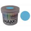
I started with a piece of Canson XL watercolour paper and loaded the Mandala 2 mask with VersaMark before running it through my Big Shot die cutting machine. Next, I covered the embossed area with clear emboss powder and heat set it. Then, I watercoloured the various design areas with Mango Tango, Turquoise and Cerulean Blue Nuance powders. While it was drying, I stamped and white heat embossed the Happy Birthday top line from the multilingual Birthday stamp in order to create the sentiment strip. I adhered it with foam tape and then added small jewels to finish off the card.


Supplies: mandala mask, sentiment stamp, Mango Tango, Turquoise and Cerulean Blue Nuance powders (Magenta), VersaMark Ink (Tsukineko), clear and white Fine Embossing powders (Simon Says Stamp), XL watercolour paper (Canson), black cardstock (Bazzill), jewels (Offray) [orange envelope shown made from CTMH cardstock

I created a coordinated envelope using the WRMK Envelope Punch Board with a matching CTMH cardstock which really makes the colours pop. If you liked the mandala used on the card and are into creating with mandalas, be sure to check out the many others in the Magenta collection here.


TTFN,


*****

Magenta products used:
Mango Tango
Nuance - MNU001 - Turquoise
Turquoise
Nuance - MNU011 - Cerulean Blue
Cerulean Blue