Pages

Wednesday, December 30, 2020

Cheers to a New Year!


I always look forward to new beginnings and we all could use a positive change for 2021. So here's a Cheers to a better year. I am sharing a snowy star themed slim line mixed media New Year's card that I made for Magenta.


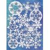
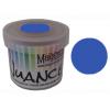
There is oodles of textures on this one, with watercolour paper texture paste on the 140 lb watercolour base. Once it was dry, I added the blues with Nuance powders. There is silver heat embossed stars adhered to vellum and covered with glitter glue. Texture paste and glitter glue covered emboss and cut larger star. There are star stenciled and silver foiled transparency pieces and a fussy cut velum based silver glitter heat embossed stamp Cheers sentiment.


Silver Shimmer Shine spray and silver metallic thread add some further sparkly shine.


Happy creating in 2021!


TTFN,


Sunday, November 29, 2020

Magenta Trees Galore


I'm up on the Magenta blog today with this collection of watercoloured Christmas tree cards. I used the Blessings Tree stamp and Emerald Creek glitter heat emboss powders to create a variety of different card looks.  I started by cutting up 9" x 12" Canson XL watercolour paper into 3 strips of 4" x 9" and then scoring and tent folding them.


The above trio was watercoloured with Grass GreenOlive and Turquoise Nuance powders after heat embossing. I went with classic colour combos of green, red and gold.The above trio was watercoloured with Grass Green, Olive and Turquoise Nuance powders after heat embossing. Once dry, I added the jewels.


This trio was watercoloured with Mijello Mission Gold watercolours and once dry, I used a Zig 05 marker to add shadowed outlines.


This final one, was watercoloured with Mijello Mission Gold watercolours and once dry the jewels were added on.


Fun, festive and easy to make these are perfect for some quick homemade cards for family and friends. I hope you are inspired to give them a try.

Happy creating!


TTFN,


Sunday, November 15, 2020

Secrets of the Sea - November Bleeding Art Challenge


Hi Crafty Friends! Today starts a new challenge month at the Bleeding Art Challenge Blog. As always it is an Anything Goes mixed media challenge. My Design Team inspiration creation for this month is a steampunk inspired artist trading coin entitled Secrets of the Sea.


That old adage something old is new again totally applies to the media used for this creation. I went into my stash and used old Tim Holtz Emboss Powders that are matte with crystals that you scrap off to give it a distressed weathered look. I used the Vintage Photo and Brushed Corduroy ones on the Creative Embellishments Steampunk Artist Trading Coins chipboard piece. I added some Seth Apter Baked Textures Patina Oxides embossing powder to in a few areas to give it an oxidized look for interest and dimension. Next, I adhered it a piece of Stamperia Mechanical Sea patterned paper. Once dry, I cut it out, sanded the sides and darkened them with a dark brown Sharpie Marker. After I fussy cut coral from the patterned paper, I added shell bits and the coral. Lastly, I adhered the Secrets metal chain band.


Head on over to the Bleeding Art Challenge Blog here to see my fellow DTs' inspirational pieces and get details on entering the challenge.

TTFN, 

Thursday, July 30, 2020

Magenta Warm Gelli Duo


A sunny hello to you! I am up on the Magenta blog today with this gelli print card duo done in warm colours.


I used a small amount of Rosebud and Golden Yellow Nuance mixed with water and brushed onto the round 4" gelli plate. I added 2 drops of clear gesso and rolled it out before taking a print pull on a 5 1/2" x 5 1/2" white cardstock cardbase. I deepened the colour by adding more powder-to-water ratio on the second one.


On this one, I stamped the Birdsong Duet - Branches with Black Soot Archival ink multiple times using a stamp repositioning tool. Next, I used a black pen to doodle circles around the edge of the gelli print. Then, I stamped the Thinking of You sentiment with the Archival ink and clear heat embossed it. Next, I added white pen details and splattered white Copic Opaque to finish it off.


On the next card, I stamped with the Curved Branch leaves in two orientations, again with the use of a stamp positioning tool. Then, I stamped and clear heat embossed the Sending Hugs sentiment. Next, I heat emboss stamped the Butterfly onto vellum, watercoloured it with the Rosebud Nuance powder prior to fussy cutting it and adhered it over the leaves.


TTFN,


*****
Magenta products used:

Nuance - MNU017 -Rosebud

Nuance - MNU008 - Golden Yellow

Wednesday, July 22, 2020

Wandering Watercolour Wonder


Hi makers! Today's ICAD was born out of a session in using yet-to-be used products purchased months ago and trying out a combination watercolouring experimentation all with challenge parameters in mind. Keeping up with my participation in  Kathy Raccosin's the Daily Marker 30 Day Color Challenge & ICAD2020, I once again incorporated them both. Wanting a vintage theme with watercolours to play along with A Vintage Journey's Watercolour Wonders proved to be an interesting challenge. I have done the shabby thing with my 'Find Joy' ICAD so trying something simply vintage had me thinking of Tim Holtz products. This reminded me that I had yet to use the new Tim's products that I had ordered from Simon Says Stamp in March due to the nuttiness that became online teaching. I had ordered the Botanical Collage Tissue Paper and the World Traveler stamp set. As I looked at each product, an idea began to form.


I started with an index card that had been used to clean up an excess of Broken China Distress Spray Stain from my craft mat during some previous crafting session. I try not to waste medium, so whenever possible, I transfer excess either on to index cards (knowing that I will use then each year during Daisy Yellow's 60 Day ICAD) or on an art journal page. I had used the 'drag through and then pat it down' technique letting it dry a bit before patting it in some more until all the ink was sopped up into the card. The Broken China blue would provide a sky background feel for the botanical elements to come.


Next, I stamped the World Traveler definition text along the right side border to match up the border distress pattern in the stamp design using Jet Black Archival ink and a stamp positioning tool. After wetting the area around my desired images on the botanical tissue image areas with a water brush, they were easy to tear away from the whole piece. I used Tim Holtz Collage Medium to adhere them to the card and then used clear gesso over top so to provide tooth for watercolouring to come. Once that was dry, I coloured the berries with Seedless Preserves and the leaves with Peeled Paint by smooching ink onto my craft mat and then using a waterbrush to add the colour. I added some splatters of each colour and then set it a side to dry. While it was drying, I fussy cut out the robin from Tim Holtz patterned paper. After hitting the card with a heat tool just to ensure the watercolour was dry, I used the collage medium to adhere the bird rightside down to image transfer it. Once it was thoroughly dry, I spritzed the bir back with water and began rubbing the paper away. Once the image transfer was revealed, I felt it was too translucent and that even with adding watercolour, it would not pop enough. Then, I remembered that I was intrigued by Kathy Raccossin watercolouring with Distress Oxides and thought that might work. And it did! It turned out that painting with Oxides has a gauche like coverage. Only thing I found was that the painting looked too flat and I am limited in Oxide colours so I took out my Inktense watercolour pencilcrayons and added outlining and details with them which really worked. I am so pleased with how the bird turned out.


While it was drying, I stamped the 'NOT ALL WHO WONDER ARE LOST' in Archival ink and then heat embossed it with clear emboss powder. Deciding it was too long, I cut the quote apart. Once the bird was dry, I distress blended the border edges of the card with Brushed Corduroy Distress ink, knowing that Opaque Crackle Paste takes on the distress colour that it is placed over. And, it didn't disappoint, as I stenciled the crackle paste on with the Blossoms stencil in three areas creating a visual triangle and then scraped on more with a palette knife to edge the entire card. Once it at over night and did its crackle thing, I adhered the quote to complete it.


Supplies: index card (Staples), Tim Holtz Broken China Distress Spray Stain, Tim Holtz Peeled Paint, Seedless Preserves & Brushed Corduroy Distress Inks, Tim Holtz Antique Linen, Vintage Photo, Walnut Stain & Fired Brick Distress Oxide Ink, Distress Collage Medium, Jet Black Archival ink, Opaque Crackle Paste (Ranger), Tim Holtz World Traveler stamp set & Blossoms Stencil (Stampers Anonymous), Tim Holtz Idea-ology Botanical Tissue Paper & patterned paper (Advantus), Tan, Baked Earth, Bark & Chilli Red Inktense watercolour pencil crayons (Derwent), Clear emboss powder (Simon Says Stamp), Clear gesso (Liquitex)

I think it has an old style illustration feel to it. I am really pleased with how it all turned out plus I learnt some new ways in which to use the Distress Oxides so all in all a successful crafting experience.


TTFN,


Saturday, July 18, 2020

Inspired by Scraps


Hello Crafty Friends! When I was rummaging through my scraps to make the ‘find Joy’ ICAD, I came across this Tim Holtz large tissue butterfly and thought it was perfect for a 4” by 6” index card. Along with that I had a leftover ‘be kind’ stamped onto muslin for the last card that I found was too big and too bold for that one but thought it was just right sizing wise when paired with the big butterfly. 


I started by stamping the Kaisercraft Flutter Moroccan design on the index card. Next, I adhered the tissue butterfly with multi-medium matte and then clear gessoed over top of it. Once that was dry, I carefully applied Clear Rock Candy Distress crackle paint around the butterfly image covering the entire index card. Once that had set up and done its crackle thing, I then painted over top of it using Finnabair’s Tiger Orange liquid acrylic adding water as I went allowing it to seep into the cracks. Next, I used the Finnabair metallic Mermaid Teal watered-down with water to paint the lighter parts of the butterfly and then splattered the whole card with some.


Once all was dry, I used a black Stabillo All pencil to outline the butterfly and add detail. Then, I used a brush and water to activate the All pencil. Using DecoFoil adhesive pen, I put some on my craft mat and then used a toothpick to apply it to the very thin design lines of the Moroccan pattern in some places. Then, I used the adhesive pen along the edge of the card and applied the gold foil there too. Next, I distressed the edges by running a scissor blade along them and added splatters of Gold Sheer Shimmer Spritz. Lastly, I adhered the pre-stamped Simon Says Stamp Big Words ‘be KIND’ and called it done.


Supplies: Big Words stamp set (Simon Says Stamp), Flutter stamp (KaiserCraft), Tim Holtz Tissue Paper (Advantus), Clear Rock Candy Distress Crackle Paint, Multi Medium Matte, Jet Black and Black Soot Archival ink (Ranger), Finnabair Tiger Orange Liquid Acrylic and Mermaid Teal Metallique acrylic (Prima), clear gesso (Liquitex), Decofoil gold foil and adhesive pen (Thermoweb), black All pencil (Stabillo), Gold Sheer Shimmer Spritz (Imagine Crafts), muslin (Misc.)


I have to laugh at myself because I went from delicate and shabby to bold and grungy. I really am an eclectic maker. I just like it all!

Once again I am joining in ICAD2020, Kathy Raccosin's the Daily Marker 30 Day Color Challenge, and SSS Flickr Challenge #154 Crazy for Coloring.


TTFN,


Thursday, July 16, 2020

Find Joy


Hello Fellow Creatives! Today, I have a watercoloured mixed media index card towards my quest of participating in Kathy Raccosin's the Daily Marker 30 Day Color ChallengeWorld Watercolour Month, and ICAD2020. The vintage style for this one was inspired by A Vintage Journey's Watercolour Wonders Challenge and my inspiration for stamp choices comes from the SSS Flickr Challenge #153 Crazy for Coloring.


I started by using up scrap bits from creations that I had in my scraps bin on my table... vintage book page text, beige tissue paper, Tim Holtz tissue paper, stamped off bits from cleaning stamps, and vintage style patterned papers. After collaging them with Multi Medium Matte, I scraped on white gesso. Once dry, I covered the entire card with clear gesso so that it would have some tooth for the watercolours. Once that was dry, I used a flower from the SSS Spring Flowers set and stamped it with Jet Black archival ink. Next, I inked up only a portion of the stamp to create the smaller flower and then decided the first bloom needed to be bigger so added an inked up portion to it too.


Instead of masking off the flowers, I decided to add in the leaves and stems but using a watercolor ink. At first I tried my go-to no-line Tim Holtz Antique Linen Distress ink but due to the background colour, that didn't work so I used one of the leaf springs stamps and inked it with Tim Holtz Peeled Paint. Next, I used water and a paint brush to move and remove the part that I didn't want; providing some colour to the back of the image. While that was drying, I began to paint the flowers and then the leaves and stems with Mijello Mission Gold watercolour paints. Once the paint had dried, I used a black Micron pen to doodle with the lines on the flowers and added lines for the leaves and stems. I splattered around the flower with green paint and then with Copic Opaque white after it had dried. Next, I arranged and stamped the sentiment using the SSS Big Words stamp set with Black Soot Archival ink and then finished the card off by sewing around the edges and adding white highlight to the sentiment with a Signo White pen.


Supplies: Spring Flowers and Big Words stamps (Simon Says Stamp), Mission Gold watercolours (Mijello), Jet Black and Black Soot Archival ink,  Multi Medium Matte, Shabby Shutters Distress Ink (Ranger), white and clear gesso (Liquitex), Pigma Micron (Sakura), Uniball Signo White pen (Mitsubishi Pencil Co.), Opaque White Ink (Copic), embroidery thread (Aurifil Mako'Ne), Tim Holtz Tissue (Advantus), index card (Staples), book text, patterned paper and beige tissue paper (Misc.)

You can check out the A Vintage Journey's Watercolour Wonders DT creations by heading to their blog here and all the other amazing colouring, watercolour and ICADs by using the hashtags #thedailymarker30day, #WorldWatercolorMonth, #dyicad2020 on social media or SSSFlickrchallenge#153 in Flickr.

TTFN,

Wednesday, July 15, 2020

Bleeding Art July Challenge - Fleur


Hi crafty friends! Today starts a new challenge month at the Bleeding Art Challenge Blog. As always it is an Anything Goes mixed media challenge. My Design Team inspiration creation for this month is a home decor canvas. I have a love of vintage things and even better if they are French inspired. This piece checks both boxes.


The background canvas was created with a layered resist technique using micro glaze and fluid acrylic paint. I started by covering the canvas with vintage collage medium. Next, I stenciled micro glaze through the Harlequin stencil and then sponged the whole canvas with slightly watered-down Emerald Fluid Acrylic. Once that was dry, I stenciled micro glaze through the Gothic stencil and sponged on watered-down Umber Fluid acrylic.


Once that was dry, I wiped off any residual micro glaze. I decided that the canvas needed some colour framing so I sponged on umber along the sides and edges and wiped some away as I went to keep with the distressed look.


Supplies: Canvas and metal letters (Dollarama), Tim Holtz Harlequin and Gothic Stencils (Stampers Anonymous), Vintage Distress Collage Medium, Distress Micro Glaze, Gold Alcohol ink Mixative (Ranger), Finnabair Emerald and Umber Fluid Acrylic (Prima), fleur de lyse ornament (RAZ imports)

While that was drying, I brushed on some Gold Mixative Alcohol ink onto parts of the metal letters so as to match the touches of gold on the fleur de lyse. Once all was dry, I adhered the fleur de lyse and metal letters to the canvas and called it done.

Here's another look at the completed canvas:


Head on over to the Bleeding Art Challenge Blog here to see my fellow DTs' inspirational pieces and get details on entering the challenge.

TTFN,